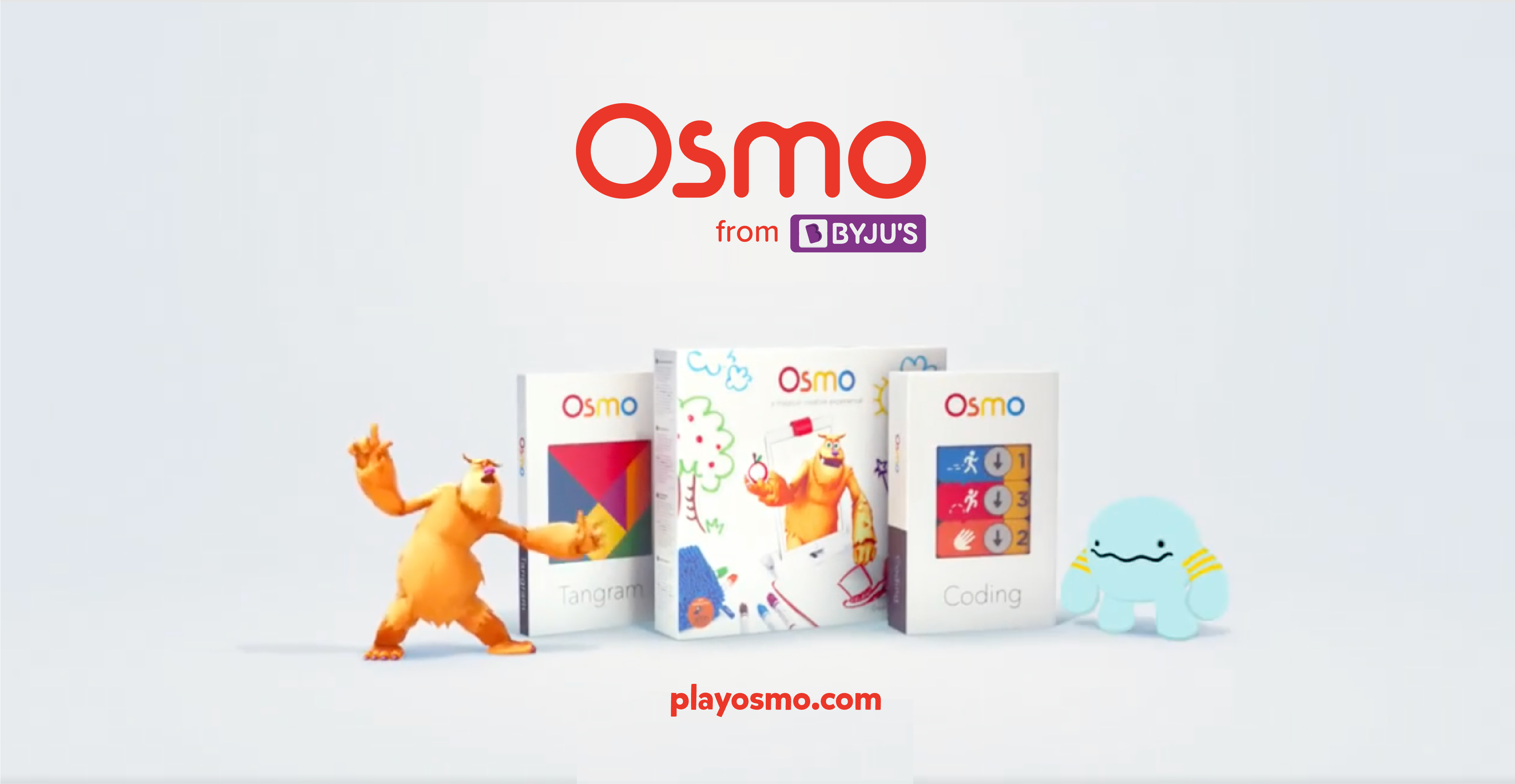
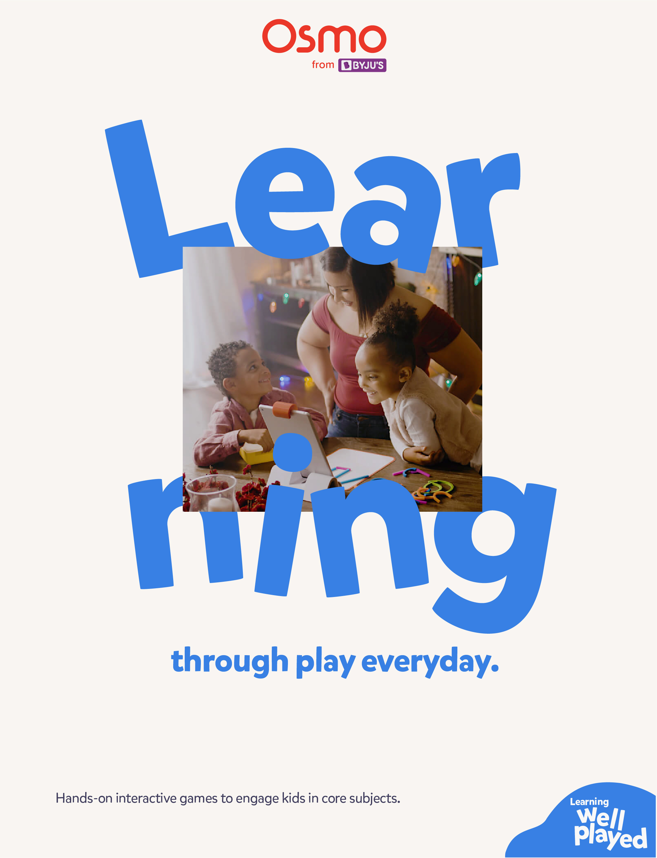
Osmo
A refreshed brand identity for Osmo — a children’s educational platfrom.
The name Osmo comes from the word Osmosis. Learning through osmosis is a form of learning that is through observation, discovery and exploration.
Though the refresh is not complete, here’s just a sneak peak at the direction the brand is heading in.

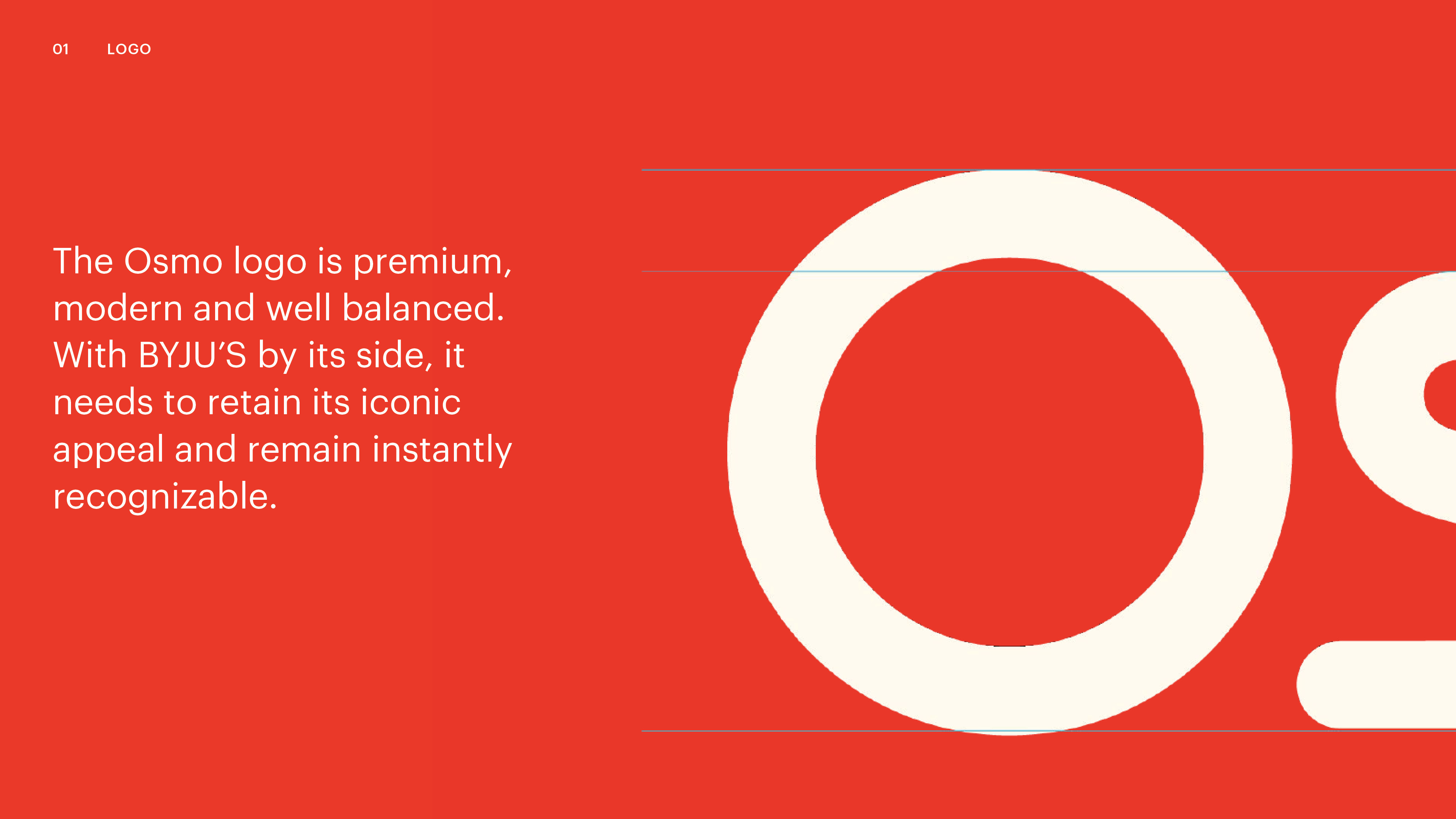
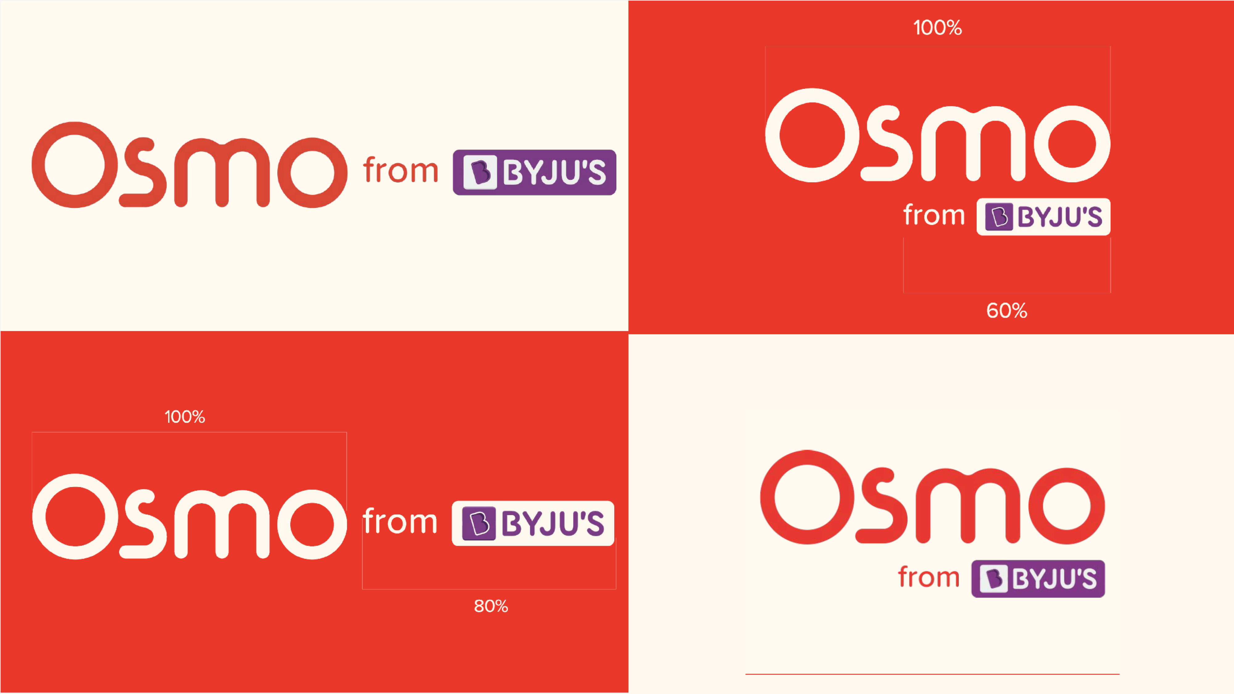
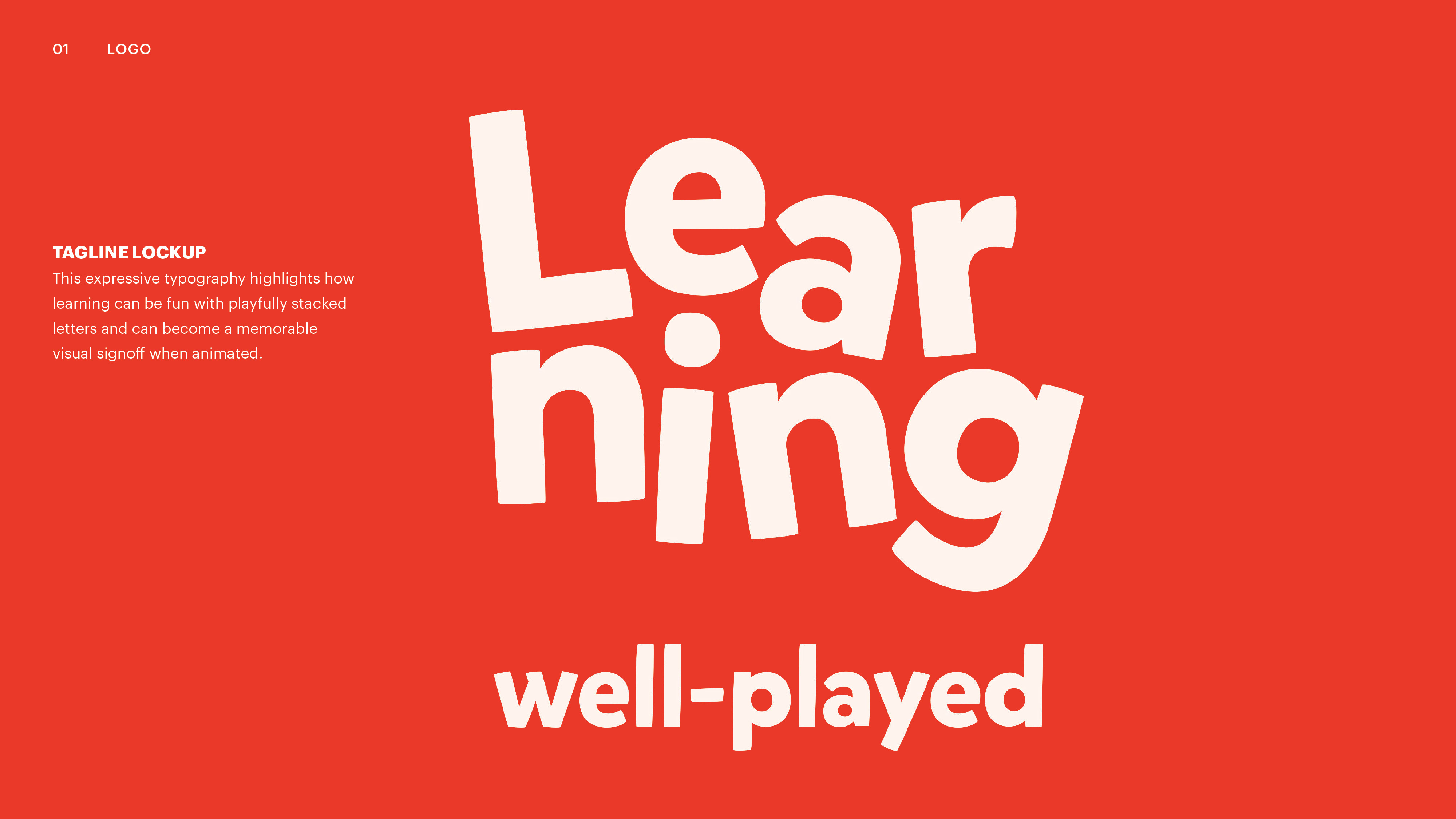
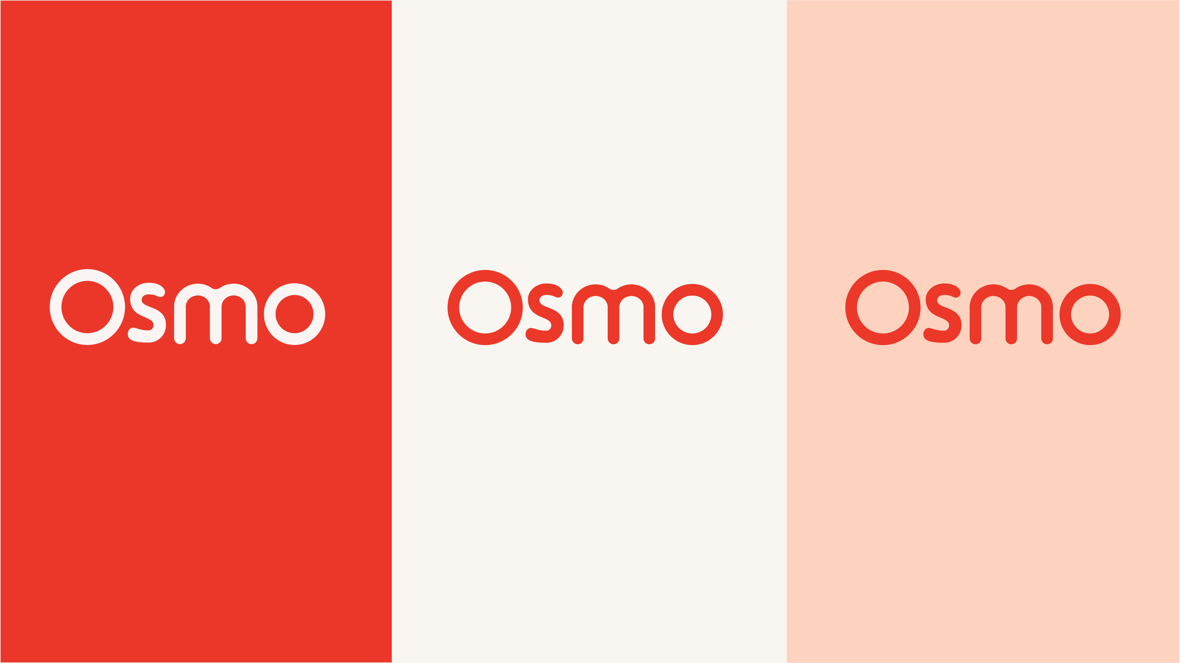
An updated wordmark to make the brand feel more modern and progressive by allowing the beak and counters of the S feel consistent with the rest of the logo.
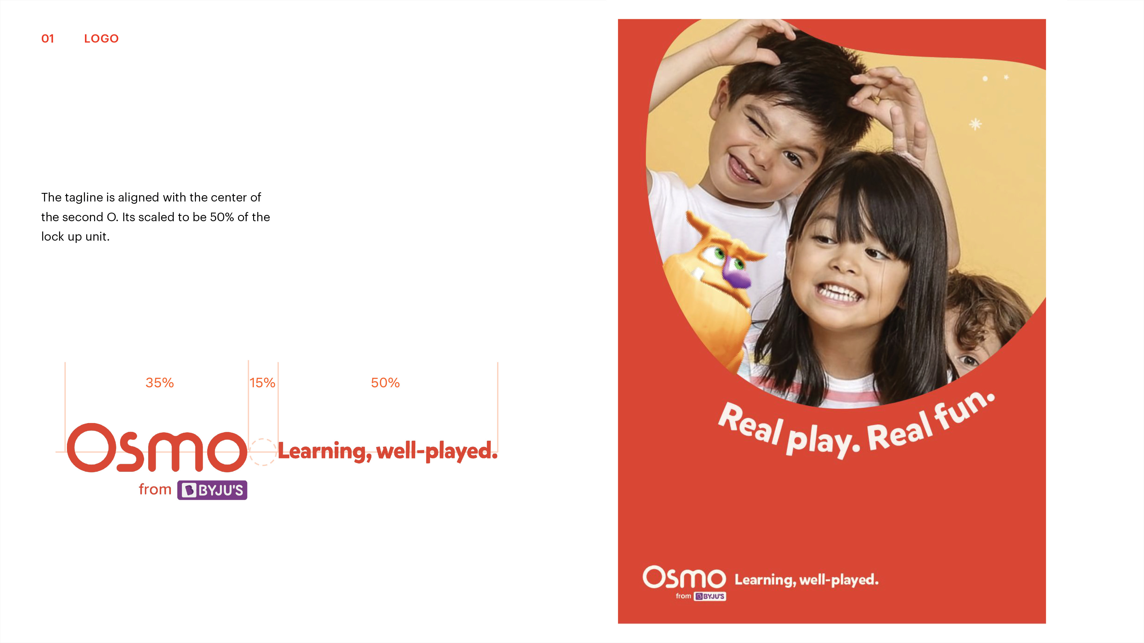
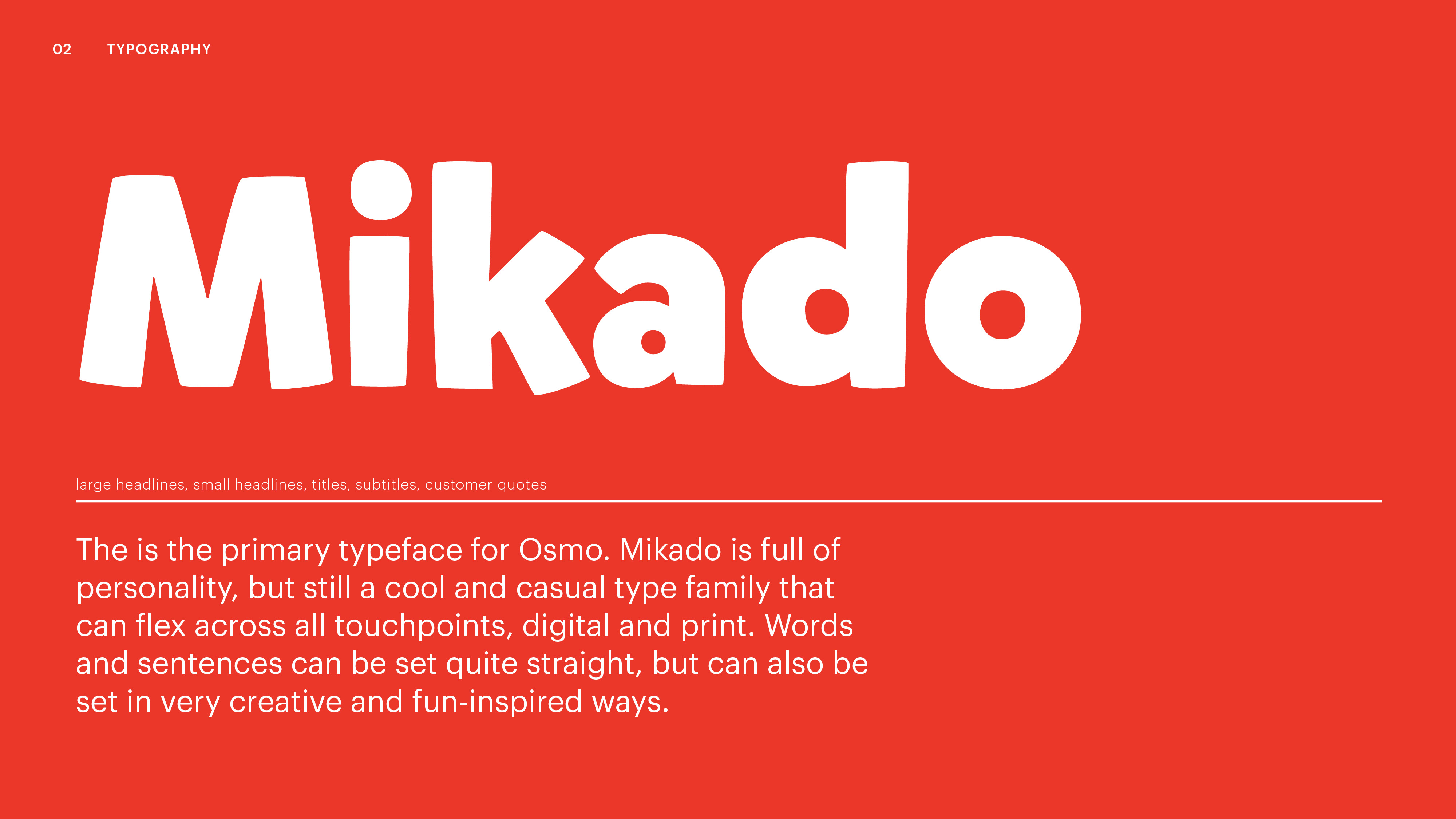
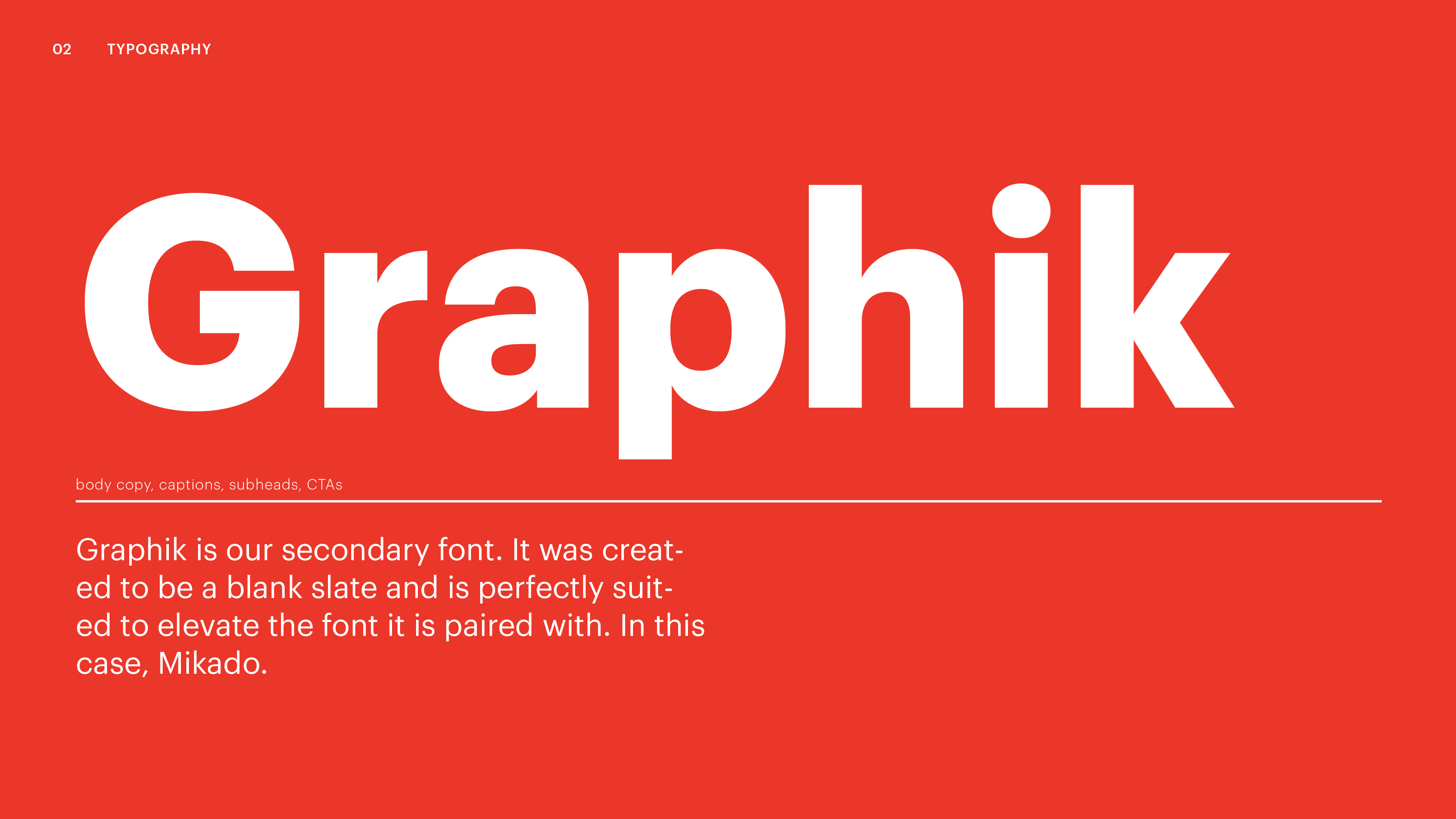
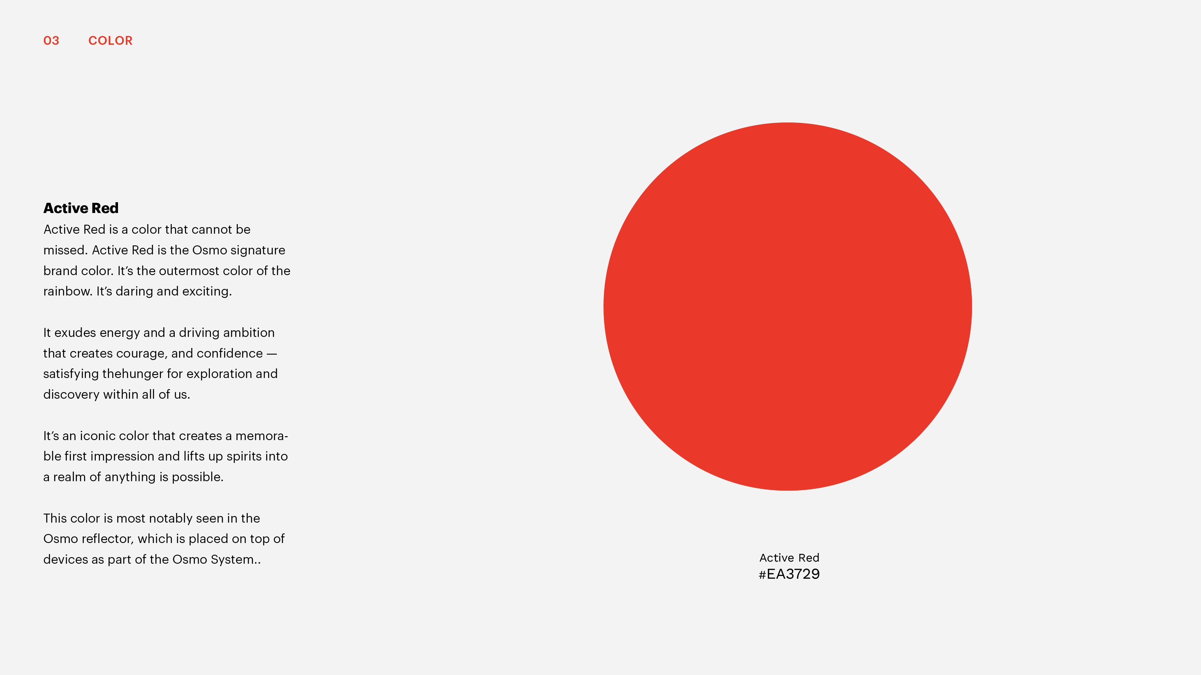
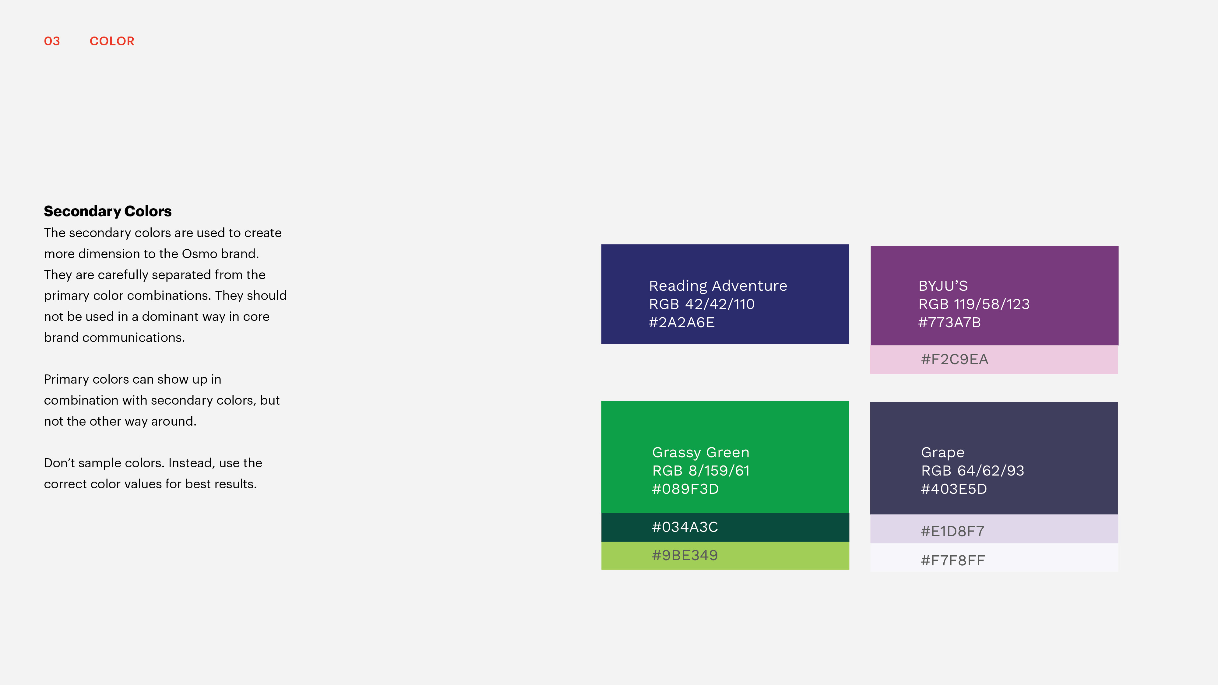
A preview to the new brand system that will be applied across all channels.


Made with
Disciplines
Disciplines
B-Reel
Brand Identity
Brand System
Graphic Design
Illustration
Typography
Brand Identity
Brand System
Graphic Design
Illustration
Typography